Your Form Has a Conversion Rate Problem. Four Diagnostics That Find It.
55% of people who start a form abandon before submitting. The page usually isn't the problem. Here are four mechanics that decide your form conversion rate, and how to check each one right now.
TL;DR
- Your form conversion rate drops roughly 2–3 percentage points for every field added above five.
- Multi-step with a progress bar lifts conversions by up to 86% on longer forms, not shorter ones.
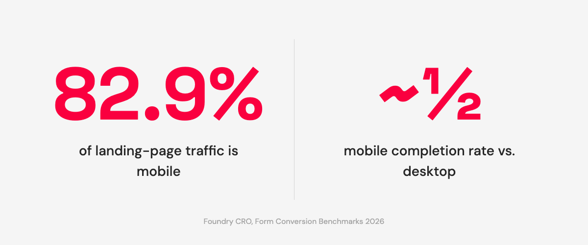
- 82.9% of your traffic is on mobile; mobile completion runs at roughly half the desktop rate.
- Some fields cost more than others. A password field drops 10.5% of visitors on contact alone.
55% of people who start a form abandon before submitting.[1]
Most founders hear that and think about the page. Wrong traffic, weak headline, trust signals buried below the fold. If that's where you are, the page-level conversion diagnostic covers it. But a lot of forms that are leaking leads sit on pages that are fine. The traffic is relevant. The headline is clear enough. The offer is real. The loss is in the form, specifically in four mechanical decisions that most people never surface, because the form was added in about ninety seconds and never looked at again.
The page gets all the attention. The form is where the money is. Everything before it is positioning. Only the form converts. Whether it does depends on decisions that are smaller than most people realize and more adjustable than most people act on.
The Field-Count Cliff
A 2026 form-conversion benchmark analysis mapped field count against conversion rate and found a very clear pattern, then a cliff.[1]
1 field: 25.5% conversion rate. 3 fields: 25%. 5 fields: 20%. 7 fields: 12%. 10 or more: below 10%.
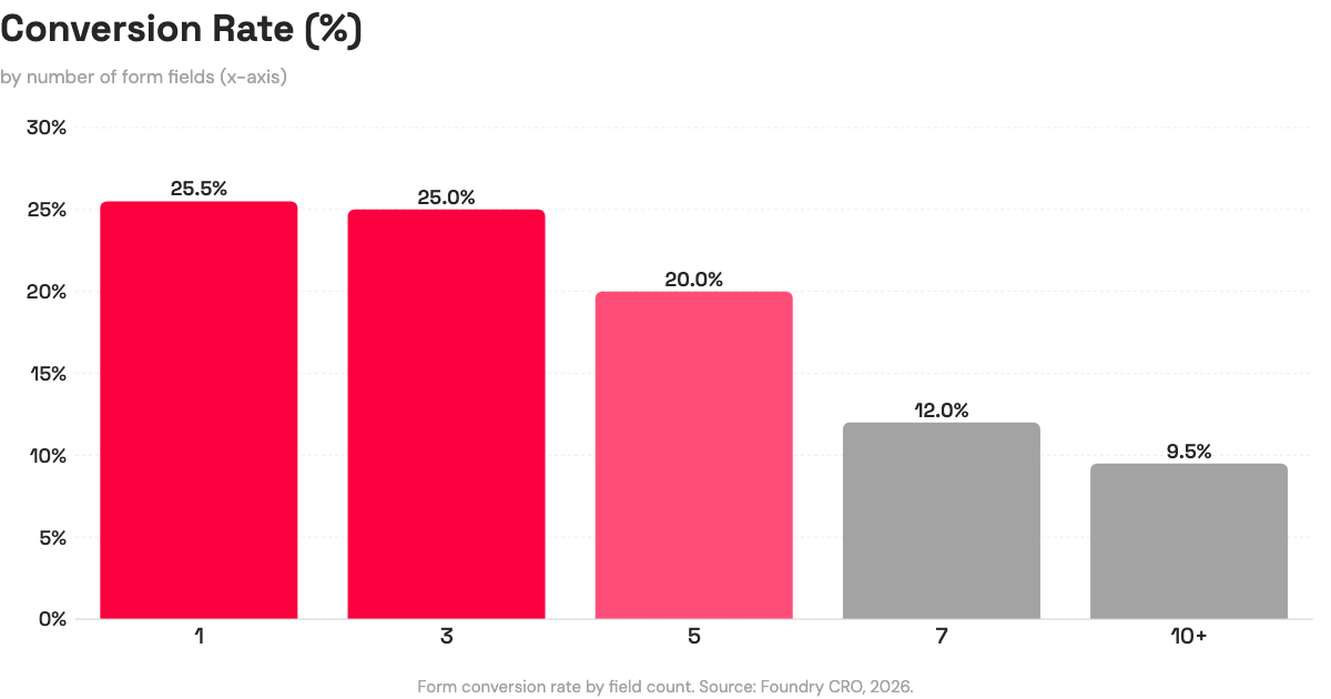
That's roughly 2–3 conversion points lost for every field above five.[1] The pattern is consistent with what Baymard Institute found in large-scale checkout usability research: optimal flow sits at 6–8 fields, and completion drops roughly 4–6% per field beyond the eighth.[2]
The instinct when you see this data is to go as short as possible. That's not quite right either. HubSpot notes that shorter forms generate more submissions but potentially lower lead quality; the right length is goal-dependent.[3] A three-field form that generates a hundred unqualified submissions is worse for the business than a five-field form that generates forty qualified ones.
The more useful question is: which of these fields do I actually use when I follow up? Not which fields would be nice to have, or which fields the template included by default, but which ones change how you respond to the person on the other end. A field you don't act on isn't a business requirement. It's friction you're charging the visitor to pay for nothing.
Run this count now, before reading further. If your form has more than five fields, identify which ones you'd genuinely miss. That answer usually surfaces one or two obvious cuts.
Field count is one dimension of the problem. But it assumes a single-page form, and for longer forms, that's the wrong structure entirely.
The Multi-Step Decision
An 86% conversion lift. That's what a 2026 benchmark analysis found for multi-step forms with a visible progress bar compared to long single-step forms.[1]
That number has an important qualifier: the lift applies to forms long enough to justify the split. A two-field form broken into two steps doesn't get simpler. It gets a step. The 86% gain comes from changing the experience of a form that already had six or more fields on a single page, not from adding structure to something short.
The mechanism is progress visibility. A form that asks for name, email, company, phone, role, and use case on one scrolling page presents the full cost at the start. A visitor scanning that page sees: six things to fill in before anything happens. The same six fields across two steps with "Step 1 of 2" visible changes what you're asking at the first moment of interaction. The immediate ask is smaller. There's evidence the form has an end. The data being collected is identical; the commitment curve is different.
Decision rule: five or more fields on a single page is where multi-step with a progress bar becomes worth testing. Three fields or fewer, single-step is almost certainly correct. The split introduces navigation overhead that isn't offset by any reduction in felt cost when the form was already short.
82.9% of the visitors reaching that form are on a phone, though. Structure decisions don't fix what mobile breaks at a more granular level.
The Mobile Completion Gap
82.9% of landing-page traffic is mobile.[1] Mobile forms complete at roughly half the desktop rate.[1]
That gap doesn't come from mobile users being less interested. It comes from forms that were designed at a desk and tested in a browser window. Three places where the loss tends to concentrate:
Keyboard mismatch. An email field that opens an alphabetical keyboard adds a step every single time someone has to find the @ symbol. One tap to switch to symbols, find @, tap it, switch back, find the period. That's three or four extra interactions for a field every email address requires. An email input type on the HTML element triggers the mail keyboard on iOS and Android automatically. A phone field with tel triggers the numeric pad. If the form was built with a default text type and no one checked, every mobile user is doing unnecessary work for every email collection field on the form.
Tap targets. Radio buttons and checkboxes that look clean at 1280px wide can be finicky at 375px. Submit buttons placed directly below the last field in a scrolling layout sometimes sit just outside the comfortable thumb zone. The gap between "visible" and "reliably tappable" matters at scale.
Scroll depth to submit. Open your form on your phone right now. How many times do you scroll before you see the submit button? A form where the button isn't visible at the last field has introduced one more moment where closing the browser tab is easier than finding the thing you're supposed to tap.
None of these are redesign problems. They're field type and layout checks that take about ten minutes on a live form. The build-side decisions about layout and field placement that apply before traffic arrives are in building a landing page without a designer. If the form is already live, the mobile check above is where to start.
Per-Field Friction: Which Fields Cost the Most
Not all fields carry equal conversion weight. Some add friction that the conversion value never pays back.
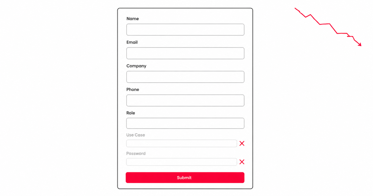
The clearest example is a password field. A 2026 form benchmark analysis found that encountering a password field produces a 10.5% immediate drop-off: visitors who see it and leave before interacting with anything else.[1] On a lead-gen form, the cognitive transaction changes the moment someone reads that field. "Leave my email" is a small ask. "Create an account" is a different proposition entirely, even if the two forms are identical in every other field. The password field is a commitment signal that doesn't match what lead-gen visitors thought they were agreeing to.
Phone number follows a similar pattern, though for different reasons. It's high friction relative to its actual conversion value unless phone follow-up is genuinely the next step in your process. Most early-stage lead-gen workflows don't use phone numbers at the capture stage; they're collected because the template included them and no one removed the field when setting up the form. A visitor who balks at providing a phone number isn't being difficult. They're reading the ask accurately: you want to call them, and they may not have agreed to that yet.
Drop-downs are worth specific attention on mobile. Baymard notes them as a consistent friction source in checkout research.[2] On a phone, a drop-down requires two taps (one to open, one to select) and doesn't trigger the auto-complete behavior that text inputs can use. When the options are three to five choices, visible radio buttons usually outperform a drop-down on mobile. The total number of taps is the same; the interaction feels more direct and the options are immediately visible.
The per-field audit is straightforward: go through every field and ask whether you act on that data when you follow up with the person. If the answer is no, that field is friction without a return. Remove it.
Four Diagnostics for Your Form Conversion Rate
Each of the four mechanics affects your form conversion rate independently. A form can have the right field count, the wrong structure for its length, a missing keyboard type on the email field, and a password field from the template that was never touched. Most underperforming forms have problems in more than one place at once.
Here's what to check:
- Count your fields. Above five? Identify which ones you'd actually miss in your follow-up process, not which ones seemed reasonable when you set the form up.
- Single page vs multi-step. Five or more fields on one screen? A split with a visible progress bar is worth testing. Three or fewer, keep it single-step.
- Open it on your phone. Check keyboard types on email and phone fields. Check tap target size on buttons and selectors. Count the scrolls to reach submit.
- Field-by-field audit. Every field should earn its conversion cost. A password field on a lead-gen form almost certainly doesn't.
The form was set up in under a minute. These checks take about ten. If any one of them surfaces something obvious (a field to cut, a step to split, a keyboard type to fix), that's almost certainly where the leads are going.
If you're building or editing on Boomlink, your form is a live, editable layer. The friction decisions above are adjustable without rebuilding the page.
Share this with the person who set up your form.
References
- Foundry CRO, "Form Conversion Rate Benchmarks 2026." Field-count curve (1 field: 25.5%, 3 fields: 25%, 5 fields: 20%, 7 fields: 12%, 10+ fields: below 10%); ~2.8 conversion points per field above 5; multi-step with progress bar: 86% lift over long single-step forms; mobile share of landing-page traffic: 82.9%; mobile completion approximately half of desktop; password field: 10.5% immediate drop-off; 55% of form starters abandon before submitting. Foundry CRO aggregates data from HubSpot, Quicksprout, WPForms, Zuko, and Formisimo; no single sample size published. https://foundrycro.com/blog/form-conversion-rate-benchmarks-2026/
- Baymard Institute, "Checkout Optimization: From 16 Form Fields to 8 Fields" / Checkout Usability research. Primary large-scale usability research. Optimal guest-checkout flow: 6–8 fields; completion drops roughly 4–6% per field beyond the eighth; drop-downs noted as a consistent checkout friction source on mobile. https://baymard.com/blog/checkout-optimization-from-16-fields-to-8
- HubSpot, "10 Form Optimization Tips to Generate Better Leads." Form-length tradeoff framing: shorter forms increase submission volume but may reduce lead quality; the right field count is goal-dependent, not universally minimal. https://blog.hubspot.com/marketing/optimize-conversion-forms