AI-Built Page Not Converting? Fix the Structure
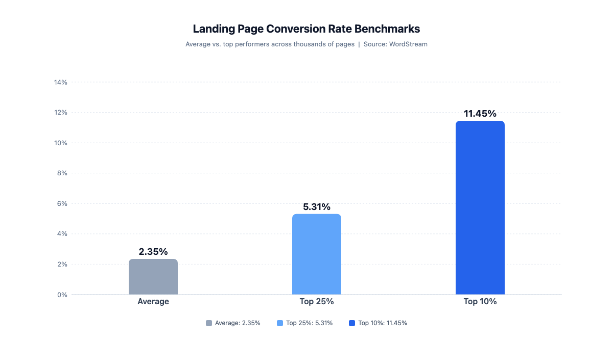
The average landing page converts at 2.35%. The top 10% hit 11.45%+. That gap is structural — find out which four decisions move a page into the top 10%.
The page is live. Visitors are arriving. And the conversion rate is sitting somewhere around — or below — what you'd generously call acceptable.
Here is the number that matters: the average landing page converts at 2.35%.[1] The top 25% convert at 5.31% or above. The top 10% reach 11.45% or higher. That's nearly a 5× spread between average and best, and most founders only discover they're at the bottom of it after the page has been live for a while and the metrics have had time to disappoint.
The usual suspects — wrong traffic, slow load, weak offer — are worth ruling out. But a lot of underconverting AI-built pages don't have those problems. The traffic is relevant. The offer is real. The page looks clean and loads fast. The problem is structural, and the structure is precisely what the AI builder didn't and couldn't decide for you.
The Numbers Behind "It Should Be Converting Better"
WordStream's analysis of thousands of Google Ads accounts — roughly $3 billion in combined annual spend — produced those benchmark numbers from a three-month filtered sample. The spread between average and top performers isn't industry noise: the 2.35% / 5.31% / 11.45% gradient holds across the dataset, and the pages at the bottom aren't consistently there because of bad traffic or bad offers.[1]
Unbounce's Conversion Benchmark Report, drawn from over 41,000 landing pages, 57 million conversions, and 464 million visitors, puts the median across industries at 6.6%, with a range of 3.8% to 12.3%. SaaS sits near the low end of that range.[2] The pages performing in the bottom third aren't losing visitors to bad design. They're losing them to friction that was left in by default, and to specificity that was never put in at all.
Both data sets point toward the same structural explanation: clarity of the value claim, friction in the conversion step, and placement of trust signals relative to the ask. None of those are visual-layer problems. They're decisions about what the page promises and how it asks.
The benchmark gap is real and it's large. Understanding why most pages land in the lower half requires looking at what an AI builder actually ships — and what it deliberately leaves open for you.
What the Builder Ships — and What It Doesn't
AI builders have gotten genuinely good at the production step. Wegic, one of the larger chat-first builders, reports over 600,000 websites created across 230 countries since 2024, with 80% of users starting from no web design experience and page generation measured in about 60 seconds.[4] A tool called SleekCMS appeared on Hacker News in early June 2026, describing itself as "a complete cloud website development platform with a vibe-coding interface."[5] The vibe-coding-as-builder model is mainstream now. A founder who wants a live page tonight can have one.
What these tools output: a layout, a visual hierarchy, copy scaffolded to whatever description you gave them, and something that renders fast and looks considered. That's genuinely more than was available three years ago, when getting the same result required a weekend with a visual editor and someone who knew what they were doing.
What they don't output is the conversion layer. Not because the tools have a gap — because those decisions require information they don't have. The specific claim your product can actually stand behind. Whether your audience responds better to a one-field form or a three-field one. Whether the social proof you have is named and specific enough to go above the fold. Whether the copy you fed the builder was precise enough to do real work, or just precise-sounding.
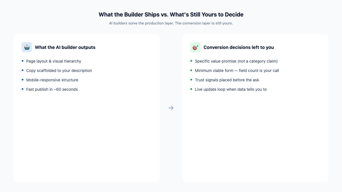
The builder produced the vessel. The conversion decisions — what goes in it and how it's arranged — were always yours to make. The pages that end up in the top 10% made four of them deliberately.
The Four Decisions That Move a Page Into the Top 10%
1. A specific promise, not a category claim
"The easiest way to manage your [thing]" is a structure, not a promise. It belongs to your whole category. The test is simple: could this headline appear unmodified on a competitor's page? If yes, the specificity decision hasn't been made.
The four-sentence exercise from building the page itself — what does it do, who is it for, what happens when you sign up, why does it matter now — forces specificity before you interact with any builder. A page built from specific inputs produces specific copy. A page built from a category description produces something that looks like a template, because it essentially is one. The AI builder output is only as specific as what you put in.
The top-10% version of this decision isn't clever copywriting. It's committing to a claim that narrows the audience deliberately and promises something the product can actually deliver. Narrow promises to the right audience convert at a completely different rate than broad promises to everyone.
2. The minimum viable form
Every field in a form is a unit of friction. The builder generates a form; it doesn't know how many fields you actually need. Most templates default to something that looks complete — name, email, company, phone — because that's what a thorough form looks like, not because it's what converts.
Fewer fields, higher completion — that's the consistent finding in conversion research. Reducing form length is typically one of the faster moves on a live page. The question isn't what information you'd like to have — it's what information you need to follow up usefully, and nothing else.
This is a live decision, not a permanent one. Start with the minimum, collect it for a few weeks, then add a field if you find you genuinely need it and can't get it another way. The mistake is beginning at six because the builder's template looked thorough.
3. Proof before the ask
The default structure on most AI-built pages puts the call to action first and the social proof further down. That makes visual sense — the primary action should be prominent. It tends to underperform.
Trust signals placed before the primary CTA outperform the reverse because visitors who don't already know you need a reason before they're ready to act. The CTA isn't the thing that makes someone decide; it's the confirmation step after they've decided. The question is what they need to read to get there.
Named, specific proof works differently from anonymous indicators. "Our lead volume doubled in the first six weeks" with a name attached is a different object than a five-star rating. If you have specific outcomes from real people, they belong adjacent to or above the CTA, not at the bottom of the page as decorative credibility. Generic testimonials placed below the fold are largely invisible to visitors who bounce before scrolling.
4. A page that actually gets updated
A page that shipped in 60 seconds and hasn't changed in 60 days has stopped learning after the first week. The conversion decisions above aren't conclusions — they're hypotheses. Visitor behavior will either confirm them or contradict them, and acting on that feedback means a page you can update without it being a project.
The one-source-of-truth model matters here for the same reason it mattered during the build: when an update is easy, it gets made. When it requires hunting down a file, rebuilding a section, and hoping nothing else broke — it gets deferred, and the page holds onto the wrong assumptions long past the point where the data made them obvious.
The Ground Is Moving: Capture Is Leaving the Page
Those four decisions operate on the page as it exists today. The environment around the page is changing, and the most consequential shift affects the capture step specifically.
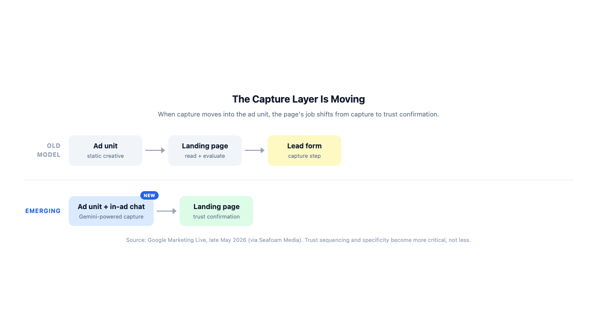
At Google Marketing Live in late May 2026, Google announced what it's calling a Business Agent for Leads — Gemini-powered conversational capture embedded directly inside the ad unit, replacing the static lead form entirely. According to secondary reporting on the announcement, the agent answers questions, pre-fills lead data from the user's Google account, and can complete the capture step before the visitor clicks through to the page at all. Initial testing is in education, automotive, and real estate.[3]
The implication for the page is precise. If capture moves to the ad, the page isn't the place where the decision gets made anymore. It's where the decision gets confirmed. A visitor who arrives having already responded to an in-ad agent isn't evaluating whether to convert — they've already done that. They're checking whether what they said yes to is actually what they thought it was.
That shifts the weight of what matters on the page. Trust sequencing and specificity — decisions two and three above — become more critical in this model, not less. A page that can't confirm the trust an ad already built will lose visitors who were already prepared to act.
The structural decisions aren't obsolete. They're harder to skip.
The page you built is live, and the conversion rate it has right now reflects the decisions that were made when it shipped — most of them by default, a few of them deliberately.
The four decisions above aren't a redesign. A specific promise, a form reduced to what you actually need, proof placed ahead of the ask, and a page you'll update when the data tells you to — those are adjustable on a live page in an afternoon, if the infrastructure makes updates easy. Boomlink's form collection is one place where the friction decision lives in practice; the field choices, as always, are yours.
If the build-side decisions haven't been made yet, that post starts there. If the page is already live and the conversion rate is the problem, start with the promise. Get the headline to say something the three nearest competitors can't repeat without lying. The rest of the gap tends to follow from there.
References
- WordStream — "What Is a Good Conversion Rate? It's Higher Than You Think!" Analysis of thousands of Google Ads accounts (~$3B combined annual spend; 3-month filtered sample). Average: 2.35%; top 25%: 5.31%+; top 10%: 11.45%+. https://www.wordstream.com/blog/ws/2014/03/17/what-is-a-good-conversion-rate
- Unbounce — Conversion Benchmark Report. Based on 41,000+ landing pages, 57M conversions, 464M visitors. Median conversion rate: 6.6%; range: 3.8%–12.3% across nine industries. https://unbounce.com/conversion-benchmark-report/
- Seafoam Media — "June 2026 Marketing News, Trends & Insights." Secondary reporting on Google Marketing Live (late May 2026). Google announced a Business Agent for Leads replacing static lead forms with Gemini-powered conversational capture embedded in ad units. Attribution: Google via Seafoam; confidence medium (secondary source, vendor announcement). https://seafoammedia.com/june-2026-marketing-news-trends-insights/
- Barchart / Wegic — "Wegic AI Website Builder … Review June 2026." Vendor-reported figures: 600,000+ websites across 230 countries; 80% of users starting from zero web design experience; ~60-second generation. Figures attributed to Wegic; not independently audited. https://www.barchart.com/story/news/2235188/wegic-ai-website-builder-promo-code-discount-review-june-2026
- Hacker News — Show HN: SleekCMS (item 48435262, posted ~June 7 2026, user yusufnb). Quoted: "a complete cloud website development platform with a vibe-coding interface." Used as a signal of the broader vibe-coding-builder trend; not a benchmark. https://news.ycombinator.com/item?id=48435262