Build a Landing Page Without a Designer Tonight
Build a landing page without a designer tonight — four decisions, no new tool to learn. Find out how AI makes the production step short enough to ship.
You know what your product does. You know who it's for and, roughly, what you want to say. The thing standing between that knowledge and a live landing page without a designer has never been design taste — it's the production step. Getting from "I know what to say" to "it's published and loading fast" has historically required learning a tool, hiring someone, or waiting until you had more time.
You probably don't have more time. You have tonight.

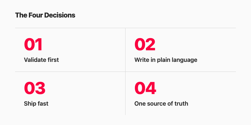
The good news is that the production step has gotten significantly shorter. The method below is four decisions, and you can make all of them in an evening:
- Decide what you're actually validating
- Write what you want to say in plain language
- Ship something fast-loading, not elaborate
- Keep one source of truth
Decide What You're Actually Validating
Most solo founders sit down to "build a landing page" without a clear answer to a simpler question: what does the page need to prove?
This matters because the answer changes everything — the headline, the call to action, even how finished the page needs to feel before it's worth showing to anyone. A page whose job is to collect waitlist signups for a waitlist-funded build looks different from a page whose job is to test whether strangers understand what you're building at all.
The starting question is: What's the one thing I'm asking someone to believe or do?
That question is also the page brief. Write the answer in one sentence. "I'm asking someone to believe that a tool can save them two hours a week on invoices, and to give me their email to find out more." That sentence determines the headline, the single call to action, and how much explanation the page actually needs — which is usually less than you think.
Design polish, at this stage, is premature optimisation. You have no evidence yet that anyone wants what you're building, which is the only situation a landing page can help you with. According to a CB Insights analysis published in March 2026 of 431 companies that shut down since 2023, 43% of failed startups cited poor product-market fit as a contributing factor — it's the second most common reason, after running out of capital.[1]
A page that ships this week can test whether demand exists. One that ships next month, after you've spent evenings on visual polish, tests the same thing — just slower, and with more sunk cost in work you might have to throw away. That inference is mine, not CB Insights'; the stat is theirs.
Once you know what you're validating, the next question is whether a stranger can understand it in eight seconds.
Write What You Want to Say, in Plain Language
Here is the exercise, and it works better if you treat it as writing, not planning:
Write four sentences:
- What does this product do?
- Who is it for?
- What happens when you sign up?
- Why does it matter now?
That output is your above-the-fold copy. It's also the exact prompt you can hand to any AI tool — or any human writer — to build the page from.
Most people skip this step and go straight to a template, a drag-and-drop editor, or an AI that generates a page based on a one-line description. The result is a page that looks like a page, but doesn't actually say anything specific. The four-sentence exercise fixes that because it forces you to commit to words before you interact with any tool. Specificity in; specificity out.
Landing pages, when the copy is right, work. Omnisend research cited by HubSpot found that landing pages have a 23% signup rate — the highest signup rate of any marketing channel.[3] The format isn't the problem. The bottleneck is usually getting the right words down without overthinking the structure.
The practical move: write the four sentences in a notes app, a text file, or wherever you already have a window open. Don't write them in the landing page tool. Write them as if you're explaining the product to a friend who'd be interested but has no context. If you can't finish sentence three — "what happens when you sign up?" — that's a product decision you haven't made yet, and it's better to surface it now than after you've been designing for two hours.
When you're done, you have the page. What you need next is a fast way to get it live — and "fast" matters more than you might expect.
Make It Fast Before You Make It Pretty
The traffic that arrives on your launch day is the most impatient traffic your page will ever see. Someone who clicks from a tweet, a Show HN thread, or a Product Hunt comment has already made a decision to check it out. A slow page reverses that decision before they've read a word.
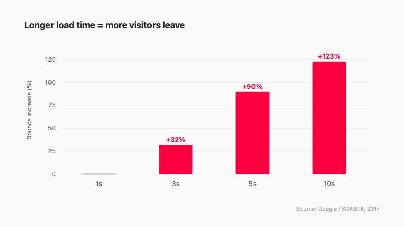
The numbers here are not subtle. Google and SOASTA analyzed mobile page load times and found that as load time increases from one second to three seconds, the probability of bounce increases by 32%. At five seconds, it increases by 90%. At ten seconds, 123%.[2] A separate Portent study cited by HubSpot found that pages loading in one second convert three times higher than pages loading in five seconds — not three percent higher, three times.[3]
A lean HTML page — or any page generated by a builder that outputs clean, minimal code and hosts it on a CDN — will outperform a more elaborate page almost every time at launch, not because it looks better, but because it loads before the visitor changes their mind.
This doesn't mean the page has to look rough. It means that complexity should earn its place. An image carousel that adds two seconds to the load time is a feature your launch page almost certainly does not need. A clear headline, a single call to action, and fast load times are the three things that actually drive results on day one.
The production question, then, is: how do you get a clean, fast page live without having to hand-write HTML or configure a server at 11 pm? That brings us to the last decision.
Keep One Source of Truth
The pages that go stale fastest are the ones spread across three tools.
You write the copy in Notion. A friend helps you mock it up in Figma. You paste the final text into a website builder that has its own editor. A week later, you change your pricing. Now you have to find every place you wrote it down — the Notion doc, the Figma file, the builder's editor — and update all three. On a launch day when something else is already breaking, that's the kind of friction that means the pricing update goes live two days late, or doesn't happen at all.
The practical fix is boring: one tool owns the page. You write there, update there, preview there, publish from there. Which tool that is matters less than the discipline of having only one.
This is where the "conversation as interface" model has a concrete advantage. If you describe your page in a chat session — to an AI that can build and publish directly — the conversation is the source of truth. You change the pricing in the same place you wrote it originally. There's no copy-paste step between "I decided to change this" and "the live page reflects the change."
Boomlink is one example of this: you build the page by describing it to ChatGPT or Claude using the MCP, preview before publishing, and update through the same chat interface. One site is free to start and serves on a Boomlink subdomain — a custom domain is part of the paid Starter plan. That's an honest description of the tradeoff; it's not the only way to keep a single source of truth, but it's the one most directly suited to the workflow this post describes.
What "Without a Designer" Means Now
The phrase "without a designer" used to mean using a template and spending a Saturday afternoon arranging blocks in a visual editor. You'd end up with something that looked like every other template on that platform, which was fine if the launch was informal, frustrating if you wanted it to look considered.
The definition has shifted. The bottleneck was never design taste. Most solo founders have a clear enough sense of what a professional page looks like. The bottleneck was the production step — the distance between knowing what you want and having the technical means to produce it.
That production step is shorter now because the interface has changed. If you can describe your product specifically — not "make me a SaaS landing page" but something like "a tool that lets solo founders track MRR without a spreadsheet, aimed at bootstrappers earning between one and ten thousand monthly, sign-up gives you an instant dashboard, launching because spreadsheets start breaking once you have fifty or more customers" — then you have access to a production capability that didn't exist a few years ago.
AI output looks generic when the input is generic. The four-sentence exercise from earlier in this post exists precisely to prevent that. A specific description produces a specific page. A vague one produces something that looks like a template, because it essentially is.
The evening framing at the top of this post isn't aspirational. It's a realistic unit of time for the method above: one decision on what you're validating, four sentences of copy, a fast-loading output from a tool that doesn't require you to learn anything new, and one place to make updates when the inevitable changes come.
One Evening Is the Right Unit of Time
The page you ship tonight will be better than the page you finish next month — not because it's more polished, but because you'll learn something from it. The feedback you get from ten signups (or zero signups) will change the page in ways you can't plan for in advance.
The bottleneck on building a landing page without a designer has never been design taste or technical ability. It has been the production step, and that step is now short enough that an evening is a reasonable planning horizon.
Try Boomlink free — describe your page to ChatGPT or Claude, preview it, and publish tonight. One site is free to start; bring your own domain when you're ready to upgrade.
References
- CB Insights — "Why Startups Fail: Top 12 Reasons" (March 5, 2026). Analysis of 431 VC-backed companies that shut down since 2023. https://www.cbinsights.com/research/report/startup-failure-reasons-top/
- Think with Google / SOASTA — "Find out how you stack up to new industry benchmarks for mobile page speed." Bounce probability at 1s / 3s / 5s / 10s load times. https://www.thinkwithgoogle.com/marketing-strategies/app-and-mobile/mobile-page-speed-new-industry-benchmarks-load-time-vs-bounce/
- HubSpot — "Landing Page Statistics" (2026). Cites Omnisend (23% landing page signup rate) and Portent (1-second pages convert 3× vs. 5-second pages). https://blog.hubspot.com/marketing/landing-page-stats