80% of Founder Landing Pages Fail a 5-Second Clarity Test (The Problem Isn't Visual)
An indie hacker audited 96 founder landing pages with AI in April 2026 and found 80% failed a basic 5-second clarity test. The failure wasn't design. It was language, and there's a specific reason founders default to it.
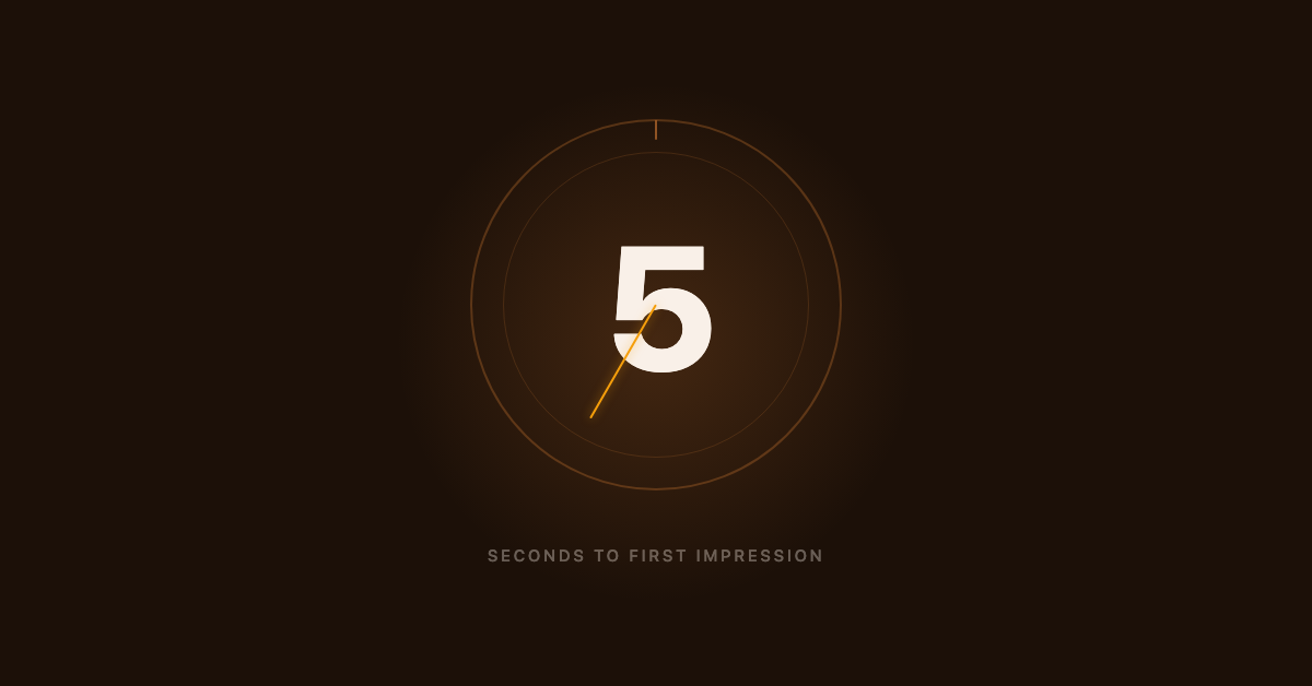
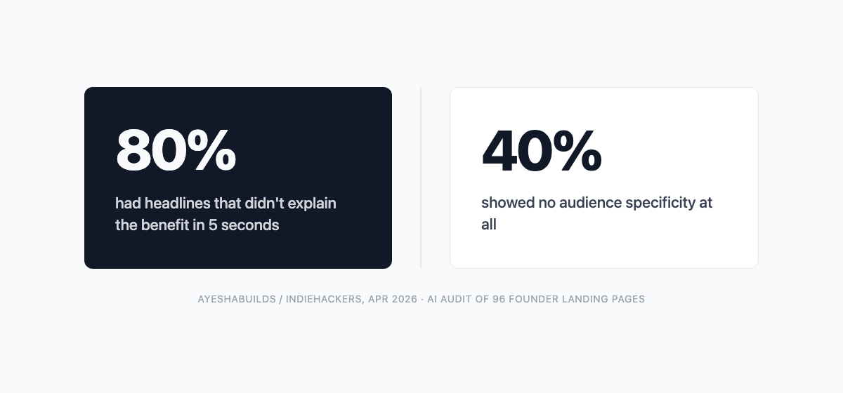
In April 2026, one indie hacker ran an AI audit of 96 founder landing pages and found that 80% of them had headlines that failed a basic five-second clarity test.[1] Not a sample of pages with obvious problems. Ninety-six active founder projects, taken as a set.
The failure wasn't visual. The layouts looked considered. The failure was that the headline described what the product was built to do, not what the visitor stood to gain. And in about 40% of the failing pages, the headline said nothing specific about who it was for at all: not just unclear on the outcome, but addressed to no one in particular.[1]
This is a language problem. It has a specific cause. And it is not fixed by a better design, a different template, or handing the copy brief to an AI builder. That last one has a wrinkle worth understanding before you hand a brief to any model.
If you're already watching your conversion metrics and want to understand where the drop is, there's a deeper post on why landing pages don't convert. This one is for the stage before: the page is live, something feels off, but you haven't run any numbers yet.
What the 5-Second Test Actually Measures
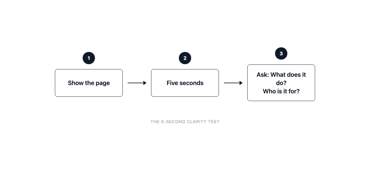
The five-second test is a method from user research: show someone a design for five seconds, take it away, then ask what they recall.[3] In a formal study you'd run a panel. The version a solo founder can run tonight is simpler. Share a screenshot with someone who hasn't seen the page. Set a five-second timer. Then ask two questions: what does this do, and is it for you?
Their hesitation is more informative than their answer.
Here's a distinction worth keeping straight. Research from Lindgaard and colleagues found that people form a visual impression of a web page in as little as 50 milliseconds.[4] That's real, but it measures something different from what we're talking about. A 50ms impression captures whether the page looks trustworthy and designed with care. It does not capture whether the headline communicates a specific outcome to a specific reader. That's verbal processing, and it operates on a longer window, closer to five seconds.
A page can pass the visual test (it looks clean, it looks intentional) while failing the clarity test (a stranger can't say what it does or who it's for). Most of the 96 pages in that April 2026 audit were in exactly that position.
What Failure Looks Like (In Founder Language)
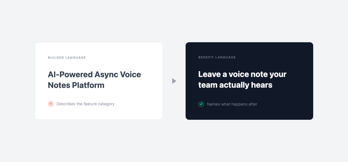
The pattern in the failing pages was consistent: the headline described what the product was built to do, not what the reader would be able to do after using it. AyeshaBuilds, the author who ran the audit, described the core finding as founders writing "headlines that describe their product, not the outcome for the visitor."[1]
| Failing headline (builder language) | Passing reframe (benefit language) |
|---|---|
| AI-powered async voice notes | Leave a voice note your team actually hears in context |
| Smart link management dashboard | One place for every link your team shares, organized automatically |
| Automated customer feedback loops | Know what your best customers think before you read their Intercom messages |
The 40% no-audience-specificity finding is its own compounding problem. A headline can gesture at a benefit and still convert poorly because it's addressed to everyone, which means it lands for no one. "Save time on research" is a benefit claim. "Save time on research if you're a solo founder writing your own fundraise docs" is a benefit claim for a person. The second one is the version a specific reader stops on.
The February 2026 IndieHackers post from raress96 makes this concrete. He ran 158 visitors to his page and made $0 in revenue, not because of a traffic problem, but because the copy was self-focused. It described what he built rather than what the buyer would gain. The fix was rewriting around the buyer's process, not the product's mechanics.[2]
Why Founders Default to Builder Language
The pattern isn't a mistake. It is a completely natural output of how someone who built a thing thinks about that thing.
A founder who spent three months on a calendar tool knows the infrastructure decisions, the scheduling algorithm, the edge cases they solved, the competitor they beat on a specific feature. That knowledge is real and hard-won. The problem is none of it lives in the visitor's head. The visitor arrives with a problem ("I keep missing the 1:1s I meant to have") and scans the page for evidence that the product solves it. If the headline describes the product's architecture, they get no such evidence.
The brain writes from what it knows most vividly. For a founder, that's the mechanism. For the visitor, the only vivid thing is the outcome they need. A founder who writes a headline from memory almost always writes a mechanism headline. "AI-enhanced scheduling with smart buffer blocks" describes the mechanism. "Stop missing your most important 1:1s" describes the week going better. The founder's version captures how they think about what they built. The visitor needs the version about what happens after.
The audience-specificity gap compounds this. When a founder thinks about who the product is for, they often think about the problem, not a person. "Anyone who needs better scheduling" is a problem description with no face. The visitor who fits a specific profile will recognize themselves when the headline names them. Everyone else keeps scanning.
This connects to something the AI-referred-visitors post covers from a different angle: who arrives on the page shapes what they need to see immediately, and that behavioral reality is upstream of almost every design decision on the page. The pattern runs deep enough that it survives even the AI-generated pages most founders now ship.
The Part AI Doesn't Fix (And Sometimes Makes Worse)
Most founders who used an AI builder to generate their page assume the messaging was handled. The page looks professional, so it must be clear.
Here's the trap, and this is my read on the pattern rather than a finding from the audit: an AI language model generates copy from the inputs it receives. If a founder described their product in mechanism terms ("I built an AI-powered async voice tool with smart thread linking"), the model turned that brief into a polished version of exactly that concept. The polish is real. The clarity problem is still there, now wearing a better font.
The model doesn't know the visitor. It knows what the founder put in the brief. So when the brief was feature-language, the output is feature-language, formatted attractively. The founder looks at the result and sees a professional page. The visitor looks at it and sees nothing that's clearly about them.
This isn't the AI's failure. The model did what it was asked. The issue is that the founder's mental model, the one that naturally reaches for mechanism descriptions, fed the model's input. The page that came out is a mirror of how the founder thinks about the product, not how a visitor needs to encounter it. Cleaner prose. Same underlying orientation.
The problem predates the AI tool. The AI just makes it easy to publish a polished version of it.
The Test You Can Run in the Next Five Minutes
Three versions, in order of how much effort they take.
Self-check (30 seconds). Cover your hero section so only the headline is visible. Ask: what outcome does this promise, and who is it for? If the answer is "it describes what the product does" or "it's for anyone who needs X," that's the failure pattern.
One-stranger test (5 minutes). Share a screenshot with someone who hasn't seen the page. Set a five-second timer. Take it back. Then ask: "What does this do?" and "Is it for you?" Their hesitation is the data. If they pause on the first question, the benefit isn't landing. If they pause on the second, the audience isn't clear.
Rewrite prompt (10 minutes). Write three headline variants that name a specific reader and a specific outcome. No feature words allowed. Then pick the one that sounds most like something a customer would say about a good week, not something a founder would say in a product demo.
Maze's research on first impressions puts the real cost in context: 55% of visitors spend less than 15 seconds on a website.[3] That's not a warning about page speed. It's a warning about how fast the window closes for the headline to do its job.
Once the headline is doing its job, the conversion metrics become useful data. Understanding why pages still don't convert after the clarity fix is a different problem.
The clarity problem is fixable. It's not a skill gap or a template problem. It's a perspective problem: the founder's perspective, baked into the brief and then into the page.
Running the self-check version takes thirty seconds. What it tells you is whether the page is explaining the product to a visitor, or the founder to themselves.
If the answer is the latter, the five-second clarity test is worth running with another founder in the same position. The "something feels off" stage is the right time to catch it, before the metrics make it obvious.
References
- AyeshaBuilds (IndieHackers): "I roasted 96 landing pages with AI this week. Here is what I'm changing." Posted April 14, 2026. Findings: 80% of pages had headlines that did not explain the benefit in the first 5 seconds; approximately 40% of failed pages showed no audience specificity. Single-author AI-assisted audit of 96 founder pages; not a peer-reviewed study. https://www.indiehackers.com/post/i-roasted-96-landing-pages-with-ai-this-week-here-is-what-im-changing-e992afc829
- raress96 (IndieHackers): "My landing page was killing my sales and I didn't know it." Posted February 25, 2026. Single-founder account of 158 visitors and $0 revenue before rewriting copy around the buyer's outcome rather than the product's mechanics. https://www.indiehackers.com/post/my-landing-page-was-killing-my-sales-and-i-didnt-know-it-ef28ef8587
- Maze: "Five-Second Testing: Step-by-Step Guide + Example." Methodology overview of five-second testing as a user research method. Includes stat: "55% of visitors spend less than 15 seconds on a website." https://maze.co/collections/user-research/five-second-test/
- Lindgaard, G., Fernandes, G., Dudek, C., & Brown, J. (2006). "Attention web designers: You have 50 milliseconds to make a good first impression!" Behaviour & Information Technology, 25(2), 115-126. Peer-reviewed study measuring visual-appeal assessment at 50ms. Note: measures visual snap judgment, not message comprehension, used here to distinguish visual from verbal processing windows. https://www.tandfonline.com/doi/abs/10.1080/01449290500330448